
What Happens to Out-of-Gamut Colors When Converting from ProPhoto RGB to Adobe RGB or sRGB?
By John Freeman, Abba’s Creations Photography
Photoshop’s Gamut Warning can show us which colors fall outside the destination color space before we make the conversion.
If I am working on a photograph in the ProPhoto RGB color space and use Photoshop’s Convert to Profile command to convert the finished image to Adobe RGB (1998) or sRGB IEC61966-2.1, what happens to colors in my photograph that the smaller color space cannot reproduce?
The short answer is: Photoshop remaps those colors to colors that can be represented within the destination color space.
But understanding what is actually happening—and previewing it before making the conversion—can be extremely useful when preparing photographs for printing or the web.
Why I Work in ProPhoto RGB
I generally convert my RAW photographs in Adobe Camera Raw using ProPhoto RGB and continue editing in ProPhoto RGB throughout my master-image workflow.
ProPhoto RGB has an extremely large color gamut. That gives me room to retain highly saturated colors captured by the camera without unnecessarily restricting them during editing.
This can be particularly important with landscape photography. Brilliant fall foliage, intensely colored sunsets and some greens, yellows and cyans can contain colors that fit within ProPhoto RGB but fall outside smaller color spaces.
The problem comes when it is time to deliver the finished photograph.
A printing company may request Adobe RGB (1998) or sRGB, while images prepared for the web are generally converted to sRGB.
At that point, the large ProPhoto RGB master has to be translated into a smaller color space.
What Does Photoshop’s Convert to Profile Actually Do?
Suppose a brilliant yellow aspen leaf in my ProPhoto RGB master contains a color that Adobe RGB cannot reproduce.
When I select:
Edit → Convert to Profile → Adobe RGB (1998)
Photoshop doesn’t simply discard the pixel or leave an invalid color behind. Its color-management system recalculates the RGB values and maps the color to one that can be represented within Adobe RGB.
Conceptually, the process looks like this:
Original ProPhoto RGB color
↓
Color lies outside Adobe RGB gamut
↓
Photoshop color conversion
↓
Reproducible Adobe RGB color
The same thing occurs when converting from ProPhoto RGB to sRGB, although sRGB generally has an even smaller gamut than Adobe RGB.
The original ProPhoto color information is no longer contained in that converted derivative. This is one reason I retain my original ProPhoto RGB master and create separate files for specific output requirements.
Rendering Intent Determines How Colors Are Mapped
Photoshop’s Convert to Profile dialog includes a setting called Rendering Intent.
Two particularly relevant choices for photographic work are Relative Colorimetric and Perceptual.
Relative Colorimetric attempts to preserve colors that already fall within the destination gamut while mapping colors outside that gamut to reproducible colors near its boundary.
Perceptual takes a different approach. It attempts to preserve the visual relationships among colors by compressing a broader range of colors into the available destination gamut.
Imagine five increasingly saturated yellows in a fall photograph:
Yellow 1 → Yellow 2 → Yellow 3 → Yellow 4 → Yellow 5
If the last two exceed the Adobe RGB gamut, Relative Colorimetric may move those extreme colors toward the limits of Adobe RGB. Some differentiation among the most saturated colors can therefore be reduced.
Perceptual rendering may instead compress a broader range of yellows in an effort to maintain the visual relationships between them.
Neither method is automatically “better” for every photograph. The appearance of the finished image matters more than simply eliminating every out-of-gamut color.
Photoshop Can Show Me the Problem Before I Convert
This is where soft proofing becomes particularly useful.
While my master photograph is still in ProPhoto RGB, I can create a Photoshop proof setup for Adobe RGB:
View → Proof Setup → Custom
I select:
Device to Simulate: Adobe RGB (1998)
I can save that setup as something like:
Adobe RGB 1998 Proof
I can create another one using:
sRGB IEC61966-2.1
and save it as:
sRGB Proof
Now I can examine what will happen to my ProPhoto master before actually converting it.
Proof Colors vs. Gamut Warning
Photoshop provides two related but different tools.
Proof Colors — Ctrl+Y
This simulates the appearance of the photograph after conversion to the selected proof space.
I can toggle Ctrl+Y on and off and compare:
Proof OFF: My ProPhoto RGB master
Proof ON: Simulation of the Adobe RGB or sRGB result
Photoshop also provides:
Gamut Warning — Shift+Ctrl+Y
With Gamut Warning enabled, Photoshop overlays a warning color—gray by default—on colors that fall outside the gamut of the selected proof destination.
For example, if I select my Adobe RGB 1998 Proof, the gray areas show me colors in my ProPhoto master that Adobe RGB cannot reproduce directly.
If I switch to my sRGB Proof, I may see considerably more of the photograph marked as out of gamut.
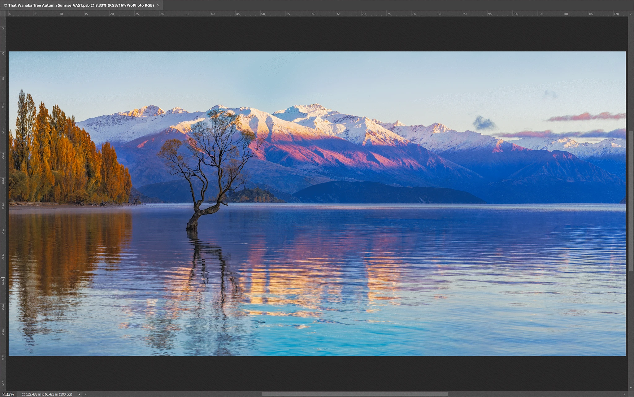
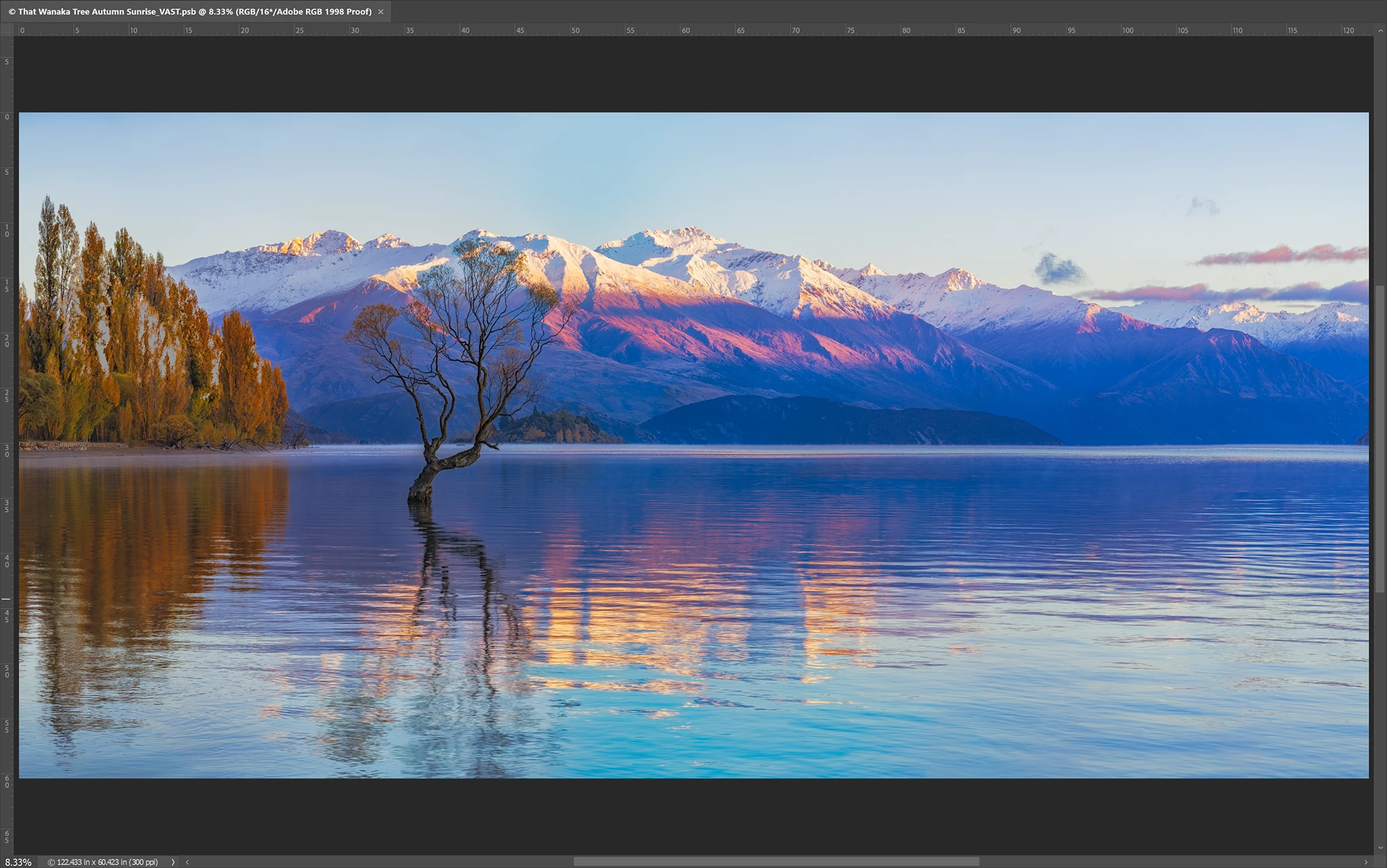
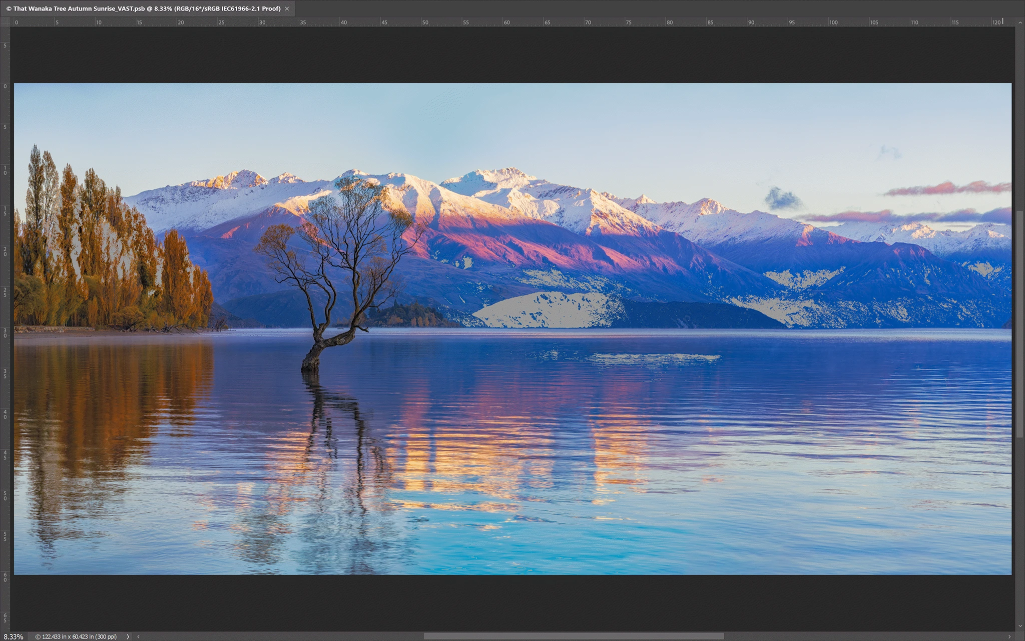
A Gamut Warning Does Not Necessarily Mean I Should Change the Photograph
This is an important distinction.
It can be tempting to see a large area covered by Photoshop’s gray gamut warning and immediately start reducing saturation until all of the gray disappears.
That isn’t necessarily a good idea.
A gamut warning tells me that a color lies outside the destination gamut. It doesn’t tell me that the eventual conversion will look bad.
Photoshop may map that color into the destination space with surprisingly little visible change.
Instead of automatically correcting every warning, I first turn Gamut Warning off, leave Proof Colors on and compare the proofed image with my ProPhoto original.
The important question isn’t:
“Are there any out-of-gamut pixels?”
The more useful question is:
“Does mapping those colors into the destination gamut cause a visually significant change in my photograph?”
If the answer is no, there may be no reason to modify the image.
When an Output-Specific Adjustment May Help
Sometimes the difference is visually important.
For example, a photograph containing extremely saturated yellow fall foliage might lose separation between subtle shades when converted to a smaller color space.
In that situation, I can make a targeted adjustment before creating the delivery file—perhaps slightly modifying saturation or another color characteristic in the affected area.
The important point is that I don’t need to compromise my ProPhoto RGB master.
I can make the adjustment specifically for the Adobe RGB or sRGB derivative while retaining the full color information in the original master.
Proofing for a Printer Is Different
The same principle becomes even more useful when a printing lab supplies an ICC profile for a particular printer, ink and paper combination.
Instead of asking Photoshop:
“What will happen when I convert this ProPhoto image to Adobe RGB?”
I can soft-proof against the printer’s ICC profile and ask:
“What colors in this photograph can’t be reproduced by this particular printing process?”
That is much more meaningful than Photoshop’s generic Working CMYK proof for photographic printing.
The printer ICC profile is normally used to simulate the output, not as the working color space for my master photograph. The lab’s instructions determine which RGB profile should actually be embedded in the submitted file.
My Practical Workflow
For my own high-resolution landscape photographs, the workflow is therefore:
RAW capture → Adobe Camera Raw → ProPhoto RGB master → edit in ProPhoto RGB → soft-proof the required destination → evaluate significant gamut changes → make output-specific adjustments if necessary → Convert to Profile → save the Adobe RGB or sRGB delivery file.
The original ProPhoto RGB master remains unchanged.
That provides the best of both worlds: I retain as much captured color information as practical during editing while still preparing a file whose colors can be properly represented in the color space required by the printer, lab or web application.